Project Overview
This independent study explored how user experience design principles are utilized within recreational cannabis dispensary websites, then translated the findings into mobile app interfaces. Through UX analysis grounded in Gestalt theory and usability heuristics, insights from existing dispensary platforms informed the design of a mobile application prototype.
Rise Cannabis App


Bud & Rita’s is a recreational cannabis dispensary with five locations across Illinois, owned by Nature’s Grace. The brand focuses on creating an approachable, educational shopping experience that empowers customers to make informed choices about their purchases.
Rise is a recreational & medical dispensary established in 2015, owned by Green Thumb Industries and operates 97 locations across 14 states. The brand focuses on providing a customer-centered experience while supporting and engaging with the communities it serves.
Illinois Cannabis Experience
As of April 2026, Illinois is home to over 270 licensed cannabis dispensaries. With the majority of the Illinois Cannabis market is catered toward recreational use, only 53 of the total 276 Illinois dispensary locations serve medical patients.
While I only intended to focused on the recreational user experience for this study, I found it important to select two dispensaries that varied in company size, number of locations and medical patient services.
Dispensary Profiles
Compared to other states, the current cannabis regulations in place in Illinois promotes a digital shopping experience. Since regulations prohibit customers from viewing dispensary cannabis products in-store while shopping. Customers have two choices, either place an online or use a digital display to place an order in-store. Regardless of the customer's shopping preference, the overall reliance on digital shopping experiences highlights the importance of user experience principals being utilized within the user flows.
Competitive Analysis Results Synthesized
Navigation & Filters
Rise includes two layers of tabs/filters, creating slight redundancy and confusion.
Bud & Rita’s also uses standard filter options but adds categories like terpenes and cannabinoids.
Both could simplify navigation to reduce cognitive load and improve flow.
Rise has the option to filter by feeling and activities, super useful when viewing cannabis products online.
Visual Design & Hierarchy
Rise has excellent content card spacing, clear product hierarchy (brand → name → type), and effective typography.
Bud & Rita’s organizes content well but suffers from low color contrast and thin outlines, making some visuals difficult to see.
Bud & Rita’s homepage tells a compelling story about education and community, while Rise feels more transactional and straightforward.
Mobile Experience
Both mobile experiences reflect their web counterpart and are essentially the web experiences resized for mobile viewing.
Because of this, the home pages on both mobile experiences are very long.
Both rely on the same industry skeleton, limiting opportunities for custom UX changes.
Rise excels in clarity and usability, while Bud & Rita’s excels in storytelling and brand personality.
These insights will inform the app design by combining Rise’s usability strengths with Bud & Rita’s educational and brand-driven approach, creating a more engaging and informative cannabis shopping experience.
Key Takeaways
Overall Structure
Both websites use a standard e-commerce skeleton with consistent placement of search, profile, and cart icons.
Both sites also rely on location-based shopping, a common industry standard
Rise features a clean, minimal layout focused on usability, while Bud & Rita’s integrates strong branding that mirrors its diner-inspired retail experience.
During my competitive analysis of both Bud & Rita's and Rise, it was extremely important to explore the mobile experiences due to the state's cannabis regulations.
User Testing Insights
User Test Procedure
Open dispensary website on mobile
Verify date of birth
Find Sativa pre-rolls
Add to cart
User Testing Questions
Name
Age
Experience with cannabis
Preferred cannabis products
Synthesized User Testing Results
Strengths
Visually appealing, bold, colorful aesthetic
Strong diner-style theme that feels fun and memorable
Distinctive brand personality that stands out from competitors
Engaging, quirky tone that users found entertaining
Feels modern, youthful, and high-energy
Appealing photography and product visuals
Weaknesses
Hard for beginners to understand products or how to choose
Long pages; some links non-functional
Lack of product reviews
Lack of educational content
Overall
Strong brand vibe, weak clarity and usability
Strengths
Clean, professional, easy-to-understand layout
Detailed, trustworthy product descriptions
Ratings, serving details, and educational info appreciated
Straightforward navigation and structure
Feels reliable and beginner-friendly
Clear categorization helps users shop with confidence
Consistent design that feels polished and legitimate
Weaknesses
Redundant navigation and repetitive deal pages
Minimal brand personality; experience felt sterile
Overall
Strong clarity and structure, low engagement/visual appeal


Design Suggestions
Visual Design & Branding
Navigation & Layout
Filtering & Product Discovery
Add background contrast and color cues to separate sections.
Incorporate brand colors to reinforce identity.
Use effect icons or visual cues to support product understanding.
Simplify top-level menus and reduce redundant links.
Allow browsing before requiring store selection.
Condense long homepages and prioritize key content.
Use beginner-friendly labels for strain, potency, and tags (ex. “Relaxing,” “Citrus,” “Berry”).
Make filters intuitive and consistent across platforms.
Include clear product size and type information.


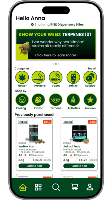
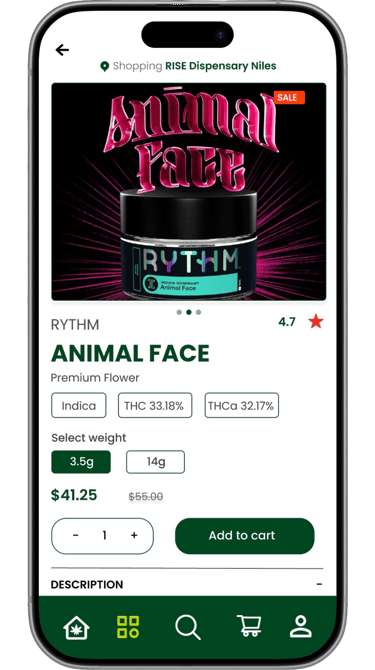
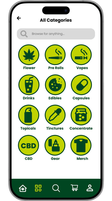
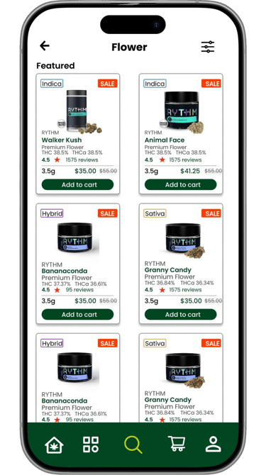
Rise Mobile App
Design Overview
Streamlined navigation designed specifically for mobile behavior
Existing graphics on Rise’s website have been optimized for the mobile experience.
Preserves Rise’s clean, professional design language while improving mobile usability and overall user experience.
Visual system updated for clarity, consistency, and ease of scanning
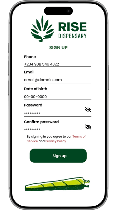
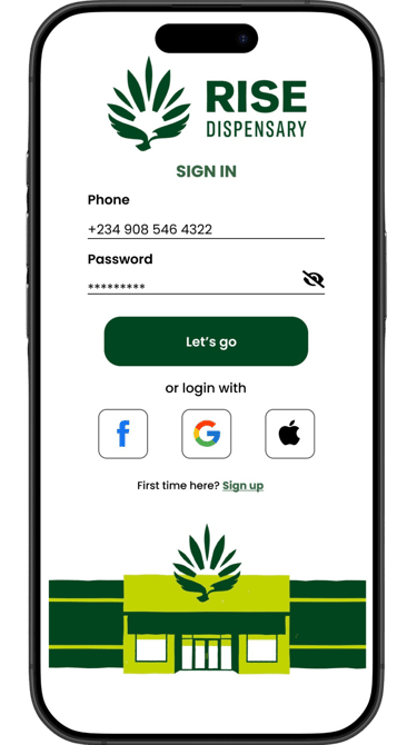
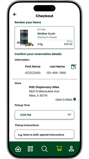
The profile information will be saved, used during the checkout process and must match a physical ID at pickup. Preventing users from re-entering information before each purchase.
Sign In & Sign Up
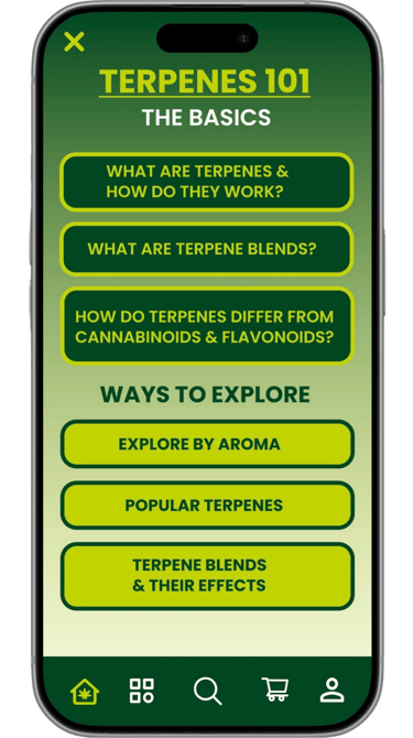
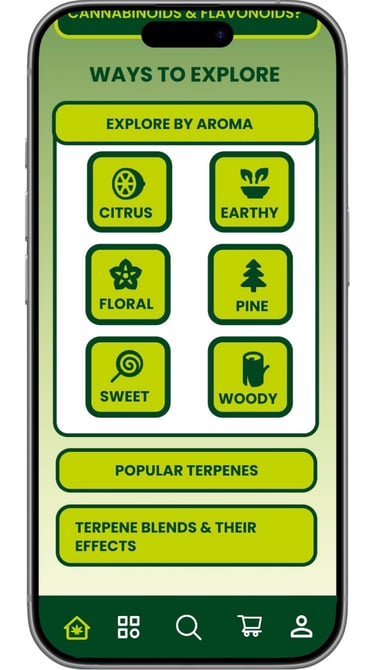
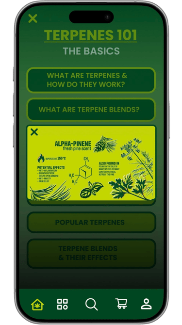
Educational Experience: Terpenes 101
Accessible by clicking the banner on the home page. This section of the app allows users to learn more about Terpenes and explore based on aroma, popularity or effects.
Terpenes 101 is an interactive & user-friendly learning section of the Rise app that educates users on Terpenes.
User Flow from left to right
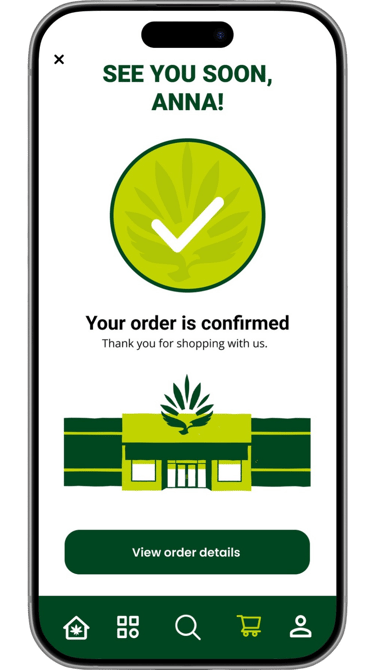
Final Screens & Prototype
View the prototype
Juliana Piotrowski