Project Overview
This UX study investigates the user experience of Temu, a rapidly growing e-commerce platform known for its low-cost products and viral marketing presence. The project aims to analyze the app's usability, visual design, navigation structure, and engagement strategies to understand how they influence user trust, satisfaction, and purchasing decisions.
Temu UX Case Study
Project Overview
This independent study explored how user experience design principles are utilized within recreational cannabis dispensary websites, then translated the findings into mobile app interfaces. Through UX analysis grounded in Gestalt theory and usability heuristics, insights from existing dispensary platforms informed the design of a mobile application prototype.
Temu UX Case Study
Tools & Research Approaches
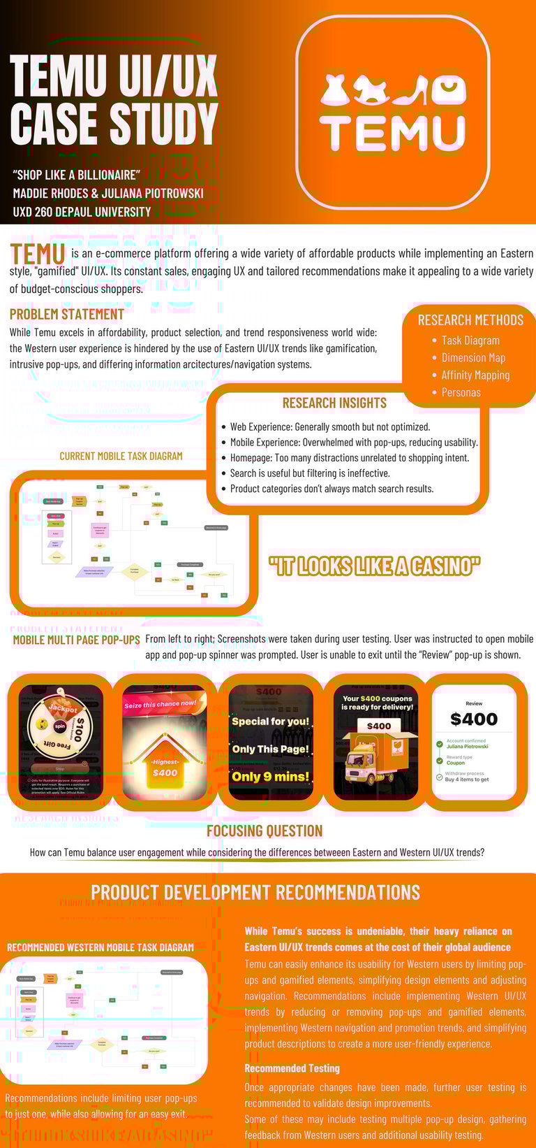
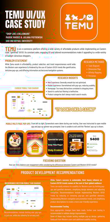
To build a comprehensive understanding of Temu's user experience, this study employed a multi-method research approach that combined evaluative, comparative, and qualitative techniques. A competitive audit benchmarked Temu against similar platforms, while a heuristic evaluation and cognitive walkthrough systematically identified usability issues across key user tasks. To capture real user perspectives, interviews were conducted with seven participants and analyzed through affinity mapping to surface recurring themes. A journey map then translated those findings into a visual narrative of the end-to-end experience, pinpointing the emotional highs and lows that most directly shaped redesign priorities.
Product Descriptions & Checkout
Product titles were overly long and confusing. Checkout flow was interrupted by upselling pop-ups, increasing cart abandonment risk.
Cluttered Mobile Interface
Excessive pop-ups and gamification create cognitive overload. Users described the app as chaotic, comparing it to a casino or “scam-like” experience.
Gamification Distrust
Spinners and daily “bonus” features eroded user trust. Many users perceived these elements as manipulative rather than engaging.
Ineffective Filtering & Search
Filtering options lacked depth and led to poor product discoverability. Product categories often mismatched actual search results.
Trust & Security Concerns
New users were skeptical about data and payment security. Transparency about how information is handled was lacking.
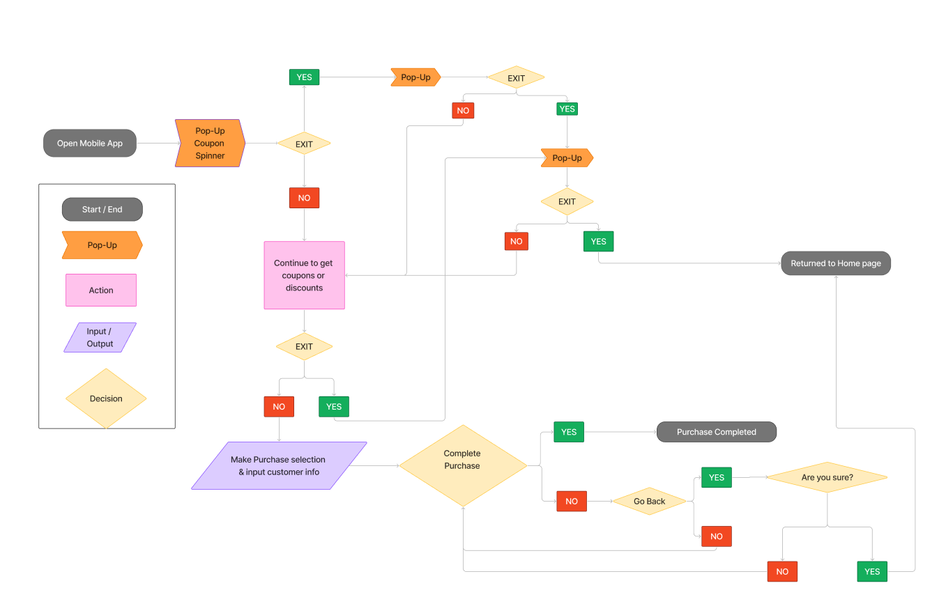
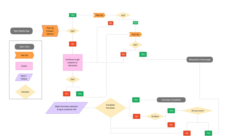
Current Mobile User Flow
(Click to expand)
The primary target audience includes price-sensitive shoppers, trend-followers, and users seeking affordable, trendy products. It also appeals to users who value a wide selection and personalized recommendations.
Synthesized Research Results
Synthesized Case Study
Building on the research findings from Phase 1, Phase 2 focused on translating insights into actionable redesign recommendations. Key focus areas included simplifying the home screen hierarchy, reducing interruptive pop-ups during checkout, improving search and filter functionality, and introducing clear trust indicators throughout the purchasing flow.
Revised user flows were developed in Figma to illustrate how targeted changes could reduce cognitive load and increase user confidence. The redesigned checkout in particular aimed to consolidate steps, remove unnecessary upsells, and present a transparent order summary earlier in the process.
The final case study document synthesizes all research, analysis, and design decisions into a cohesive narrative. Demonstrating how a user-centered approach can address Temu's core usability challenges without sacrificing its high-energy visual brand.
Juliana Piotrowski