
Executive Summary
Caterpillar's current CPM payload interface overwhelms operators with dense, undifferentiated information during active truck loading, a problem intensified by the shift to a smaller portrait display. But, by emphasizing important information, making commonly used functions more accessible, and developing a more user-friendly and uniform interface across machine types, this redesign aims to lessen operator cognitive burden. through progressive disclosure, glanceable information hierarchy, and reduced cognitive demand.
Caterpillar CPM Redesign
Timeline
20 Weeks
Project Overview
Caterpillar's CPM payload interface overwhelms operators with dense, undifferentiated information during active truck loading, a problem intensified by the shift to a smaller portrait display; we address this through progressive disclosure, glanceable information hierarchy, and reduced cognitive demand.
Problem Statement
The existing interface requires operators to interpret and browse at crucial periods, which increases the problem as the display grows smaller. Operators must quickly verify the loading status and respond quickly.
Goal
By emphasizing important information, making commonly used functions more accessible, and developing a more user-friendly and uniform interface across machine types, this redesign aims to lessen operator cognitive burden. Clearer hierarchy, simpler navigation, and multimodal input that reduces reliance on visual attention alone should all help the system facilitate quicker decision-making.
Tools
Figma
Cursor
FigJam
Microsoft
PowerPoint
Roles
User Research, Testing & Product Designer
Team
Tuguldur Enkhsaruul Jessica King Madelyn Rhodes Juliana Piotrowski Cornelious Williams
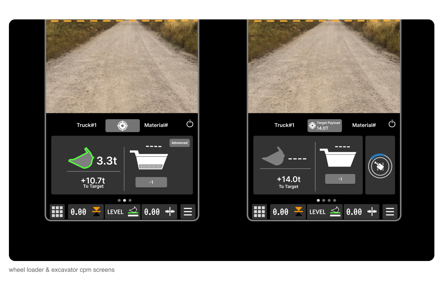
Problem Space
Wheel Loader


Both interfaces show target payload, bed weight, and bucket weight, but vary drastically visually. This causes forced re-learning and information overwhelm.
Getting the basic payload section to be as simple and cross compatible for machines was our top priority.
The element’s size hierarchy did not assist the user in finding the most important information, so we focused on making functional elements and more important imformation
The existing interface requires operators to interpret and browse at crucial periods, which increases the problem as the display grows smaller. Operators must quickly verify the loading status and respond quickly.
The goal is to combine all of the three interfaces into one, but the compression of the screen size highlights the weakness of the information hierarchy of information
Excavator
Current Interfaces

Design Process
What We Learned From Operators
Cross Machine Consistency
Opportunities



Reduce Cognitive Load
Mental Model Support
Screen Size & Visibility


Operators need glanceable payload confirmation. Critical status must be understood in seconds without mental math.
Too much information creates cognitive overload Important payload data competes with secondary controls and settings.
Inconsistent interfaces increase learning friction. Different machine layouts force operators to relearn workflows.
Through operator interviews, workflow analysis, and existing CPM system reviews, we identified several recurring usability issues that slowed loading efficiency and increased cognitive strain during active operation.


Design System
Empty bucket, material added, & good weigh states.
Redesigned existing truck status icons to show edit target, default state (target set), last pass, overweight, and at target weigh states.
Progress indicator built into the icons.
Flows and Wireframes


We acted out and recreated various user scenarios to explore all possible flows before finalizing them. These flows were then turned into low-fidelity prototypes for the first round of testing.










Design Process
KEY FEATURE #3
Cross-Machine Consistency
Layouts, controls, and iconography were standardized across wheel loaders and excavators to reduce relearning friction
Standardizing layouts, controls & iconography
No need to relearn different systems across vehicles
Reduces cognitive load
Reduces training friction
KEY FEATURE #1
Progressive Disclosure
Advanced CPM tools and secondary controls are hidden until needed, reducing cognitive overload during active loading.
Show the operators what's important
Advanced settings and tools stay hidden
KEY FEATURE #2
Glanceable Information
Critical payload information is prioritized front and center so operators can confirm status within seconds with out mental math
Critical Information like truck weight, bucket weight, & target
Helps operators not do mental math
Speeds up loading and unloading
Competitive Analysis Results Synthesized
Navigation & Filters
Rise includes two layers of tabs/filters, creating slight redundancy and confusion.
Bud & Rita’s also uses standard filter options but adds categories like terpenes and cannabinoids.
Both could simplify navigation to reduce cognitive load and improve flow.
Rise has the option to filter by feeling and activities, super useful when viewing cannabis products online.
Visual Design & Hierarchy
Rise has excellent content card spacing, clear product hierarchy (brand → name → type), and effective typography.
Bud & Rita’s organizes content well but suffers from low color contrast and thin outlines, making some visuals difficult to see.
Bud & Rita’s homepage tells a compelling story about education and community, while Rise feels more transactional and straightforward.
Mobile Experience
Both mobile experiences reflect their web counterpart and are essentially the web experiences resized for mobile viewing.
Because of this, the home pages on both mobile experiences are very long.
Both rely on the same industry skeleton, limiting opportunities for custom UX changes.
Rise excels in clarity and usability, while Bud & Rita’s excels in storytelling and brand personality.
These insights will inform the app design by combining Rise’s usability strengths with Bud & Rita’s educational and brand-driven approach, creating a more engaging and informative cannabis shopping experience.
Key Takeaways
Overall Structure
Both websites use a standard e-commerce skeleton with consistent placement of search, profile, and cart icons.
Both sites also rely on location-based shopping, a common industry standard
Rise features a clean, minimal layout focused on usability, while Bud & Rita’s integrates strong branding that mirrors its diner-inspired retail experience.
During my competitive analysis of both Bud & Rita's and Rise, it was extremely important to explore the mobile experiences due to the state's cannabis regulations.
User Testing Insights
User Test Procedure
Open dispensary website on mobile
Verify date of birth
Find Sativa pre-rolls
Add to cart
User Testing Questions
Name
Age
Experience with cannabis
Preferred cannabis products
Synthesized User Testing Results
Strengths
Visually appealing, bold, colorful aesthetic
Strong diner-style theme that feels fun and memorable
Distinctive brand personality that stands out from competitors
Engaging, quirky tone that users found entertaining
Feels modern, youthful, and high-energy
Appealing photography and product visuals
Weaknesses
Hard for beginners to understand products or how to choose
Long pages; some links non-functional
Lack of product reviews
Lack of educational content
Overall
Strong brand vibe, weak clarity and usability
Strengths
Clean, professional, easy-to-understand layout
Detailed, trustworthy product descriptions
Ratings, serving details, and educational info appreciated
Straightforward navigation and structure
Feels reliable and beginner-friendly
Clear categorization helps users shop with confidence
Consistent design that feels polished and legitimate
Weaknesses
Redundant navigation and repetitive deal pages
Minimal brand personality; experience felt sterile
Overall
Strong clarity and structure, low engagement/visual appeal




Rise Mobile App
Design Overview
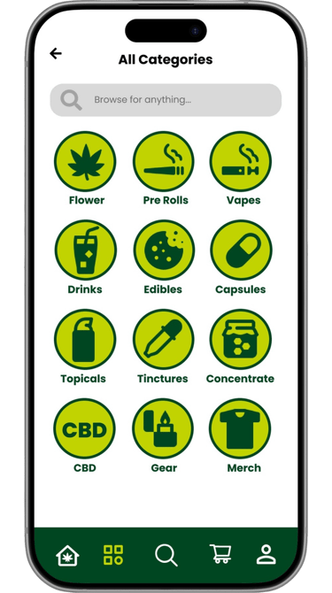
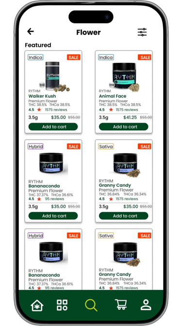
Streamlined navigation designed specifically for mobile behavior
Existing graphics on Rise’s website have been optimized for the mobile experience.
Preserves Rise’s clean, professional design language while improving mobile usability and overall user experience.
Visual system updated for clarity, consistency, and ease of scanning
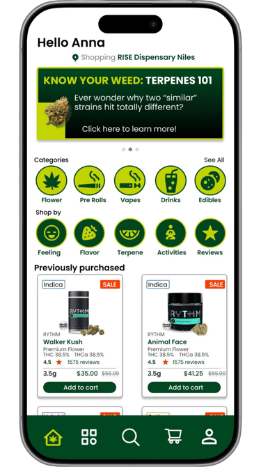
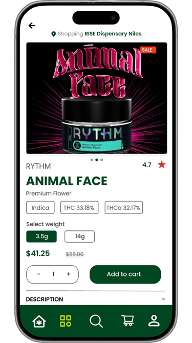
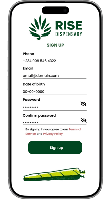
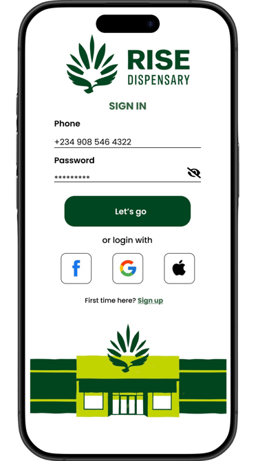
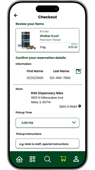
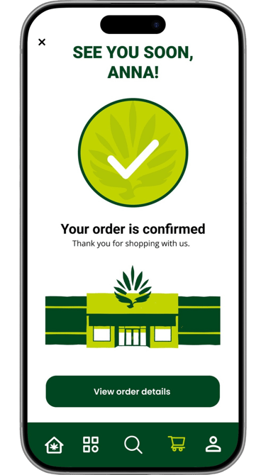
The profile information will be saved, used during the checkout process and must match a physical ID at pickup. Preventing users from re-entering information before each purchase.
Sign In & Sign Up

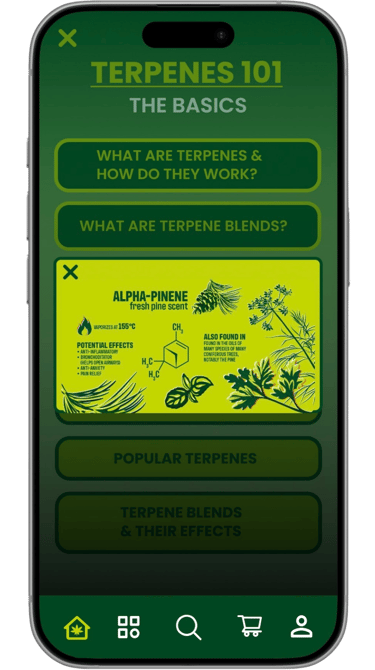
Educational Experience: Terpenes 101
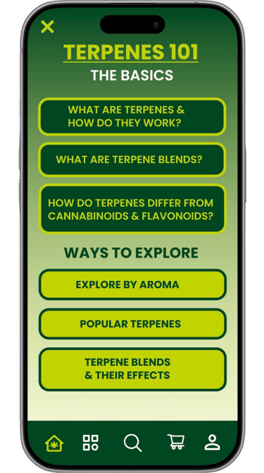
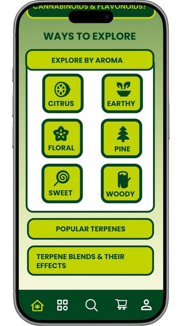
Accessible by clicking the banner on the home page. This section of the app allows users to learn more about Terpenes and explore based on aroma, popularity or effects.
Terpenes 101 is an interactive & user-friendly learning section of the Rise app that educates users on Terpenes.
User Flow from left to right
Final Screens & Prototype
View the prototype
Juliana Piotrowski